Results for "colourwise"
Colourwise refers to the systematic approach to using color in design, art, and branding. It emphasizes the importance of color theory and its impact on aesthetics and perception.


![[LIVE EXCLUSIVE] UCHOIZE Hair Dye Shampoo 100ml x3 Bundle – 5-in-1 Gray Coverage Shampoo, Fast Color Deposit, Plant-Based Botanical Formula, Travel Size Color Shampoo for Gray Hair, Shiny Healthy Hair – Black, Red & Dark Brown](https://p16-oec-general-useast5.ttcdn-us.com/tos-useast5-i-omjb5zjo8w-tx/770847b3bbee4a29ab7225cfa2f5e29f~tplv-fhlh96nyum-crop-webp:300:300.webp?dr=12190&t=555f072d&ps=933b5bde&shp=8dbd94bf&shcp=a6e80448&idc=useast5&from=2378011839 "[LIVE EXCLUSIVE] UCHOIZE Hair Dye Shampoo 100ml x3 Bundle – 5-in-1 Gray Coverage Shampoo, Fast Color Deposit, Plant-Based Botanical Formula, Travel Size Color Shampoo for Gray Hair, Shiny Healthy Hair – Black, Red & Dark Brown")


")
 Soft Curled Front Layered Straight w/ Subtle Flicked Ends Synthetic Wig | 【Heat Resistant】【Cap Included】 | #9 FSGA")


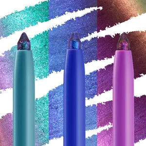
ColourPop Cosmetics

4.5
2.4K sold
-24%$21.90$29.00
")
ColourPop Cosmetics
4.6
47.6K sold
-34%$19.00$29.00


ColourPop Cosmetics
4.9
6.0K sold
-16%$31.98$38.00

ColourPop Cosmetics
4.9
12.1K sold
-15%$12.80$15.00


ColourPop Cosmetics
4.7
48.9K sold
-65%$26.49$75.00

ColourPop Cosmetics
4.9
18.8K sold
-16%$31.98$38.00

ColourPop Cosmetics
4.5
34.3K sold
-64%$31.10$86.00


Related Searches
Related Categories
Introduction
Understanding colourwise principles is essential for anyone involved in design, art, or branding. Colourwise focuses on how colors interact, evoke emotions, and influence consumer behavior. By applying colourwise strategies, designers can create visually appealing works that resonate with audiences.
Here are some key aspects of colourwise to consider:
Here are some key aspects of colourwise to consider:
- Color Theory: Familiarize yourself with the color wheel, primary, secondary, and tertiary colors.
- Emotional Impact: Different colors evoke different feelings; for example, blue can convey trust, while red can evoke excitement.
- Brand Identity: Consistent use of color can enhance brand recognition and loyalty.
- Accessibility: Ensure color choices are accessible to all users, including those with visual impairments.
- Trends: Stay updated on color trends to ensure your designs remain relevant.