all coca cola logos
The Coca-Cola logo is an iconic symbol representing the Coca-Cola Company, known for its distinctive cursive font and vibrant red color. Over the years, the logo has undergone various design changes but has maintained its core elements that reflect the brand's heritage and global recognition.
Featured brands
Authenticated productsVerified shops



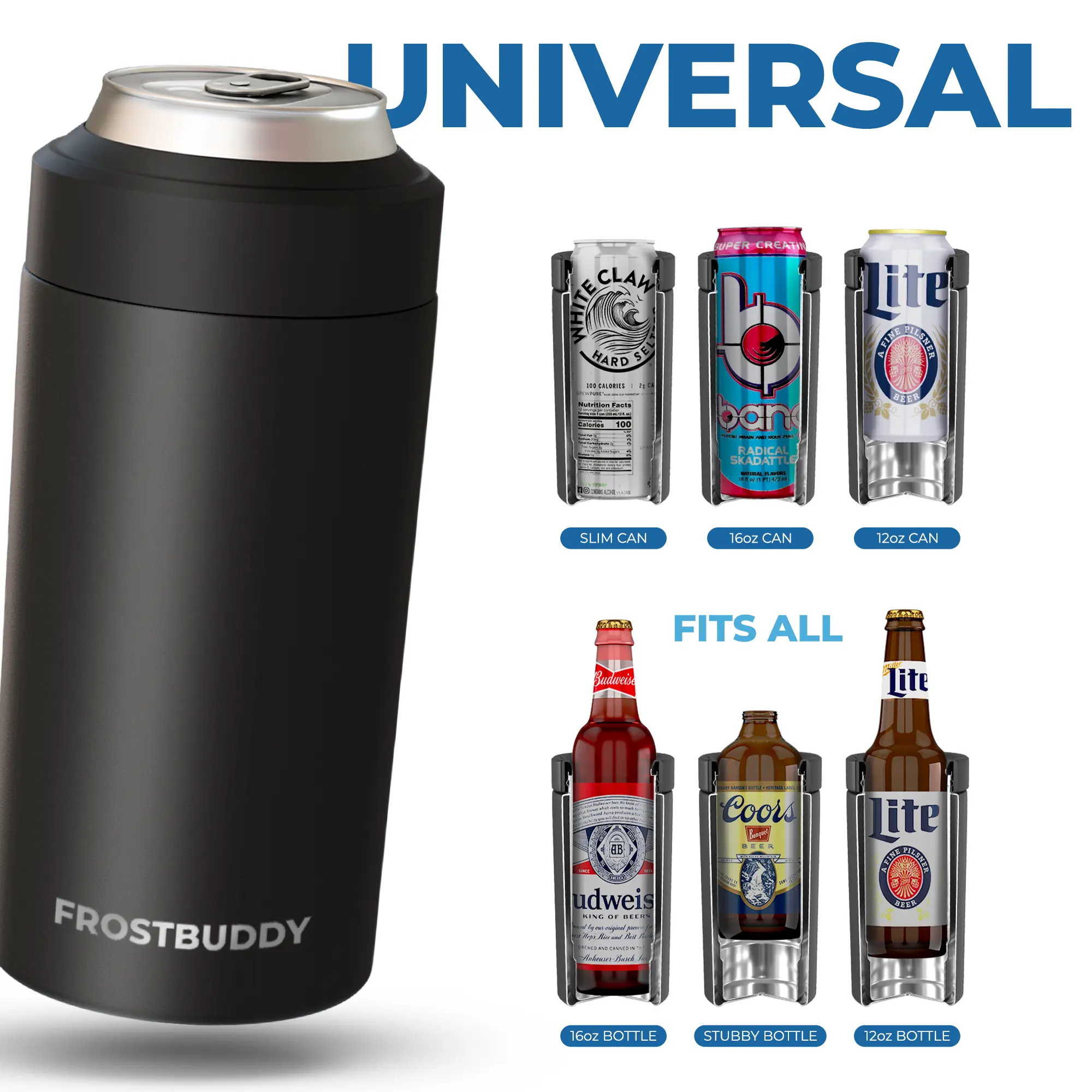


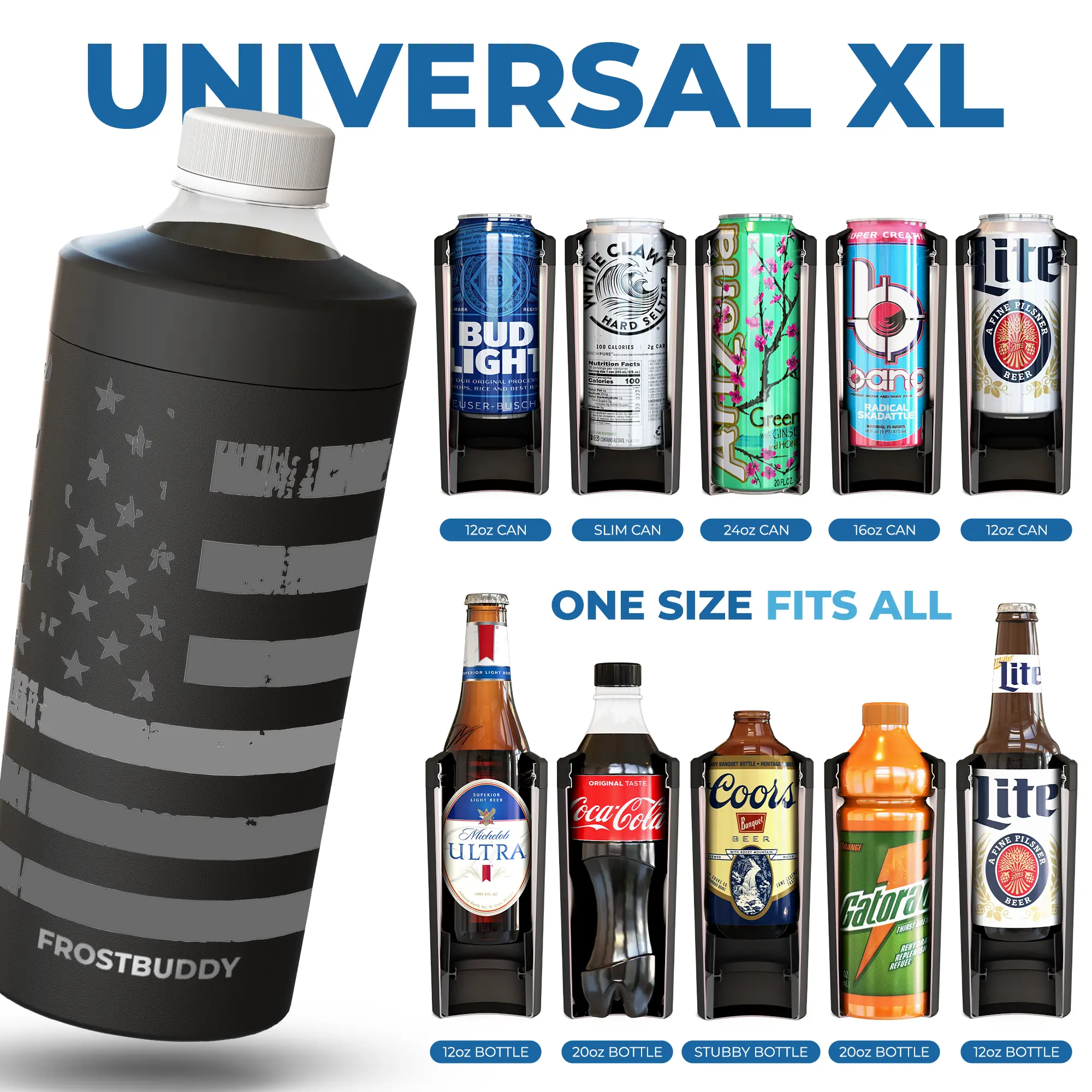
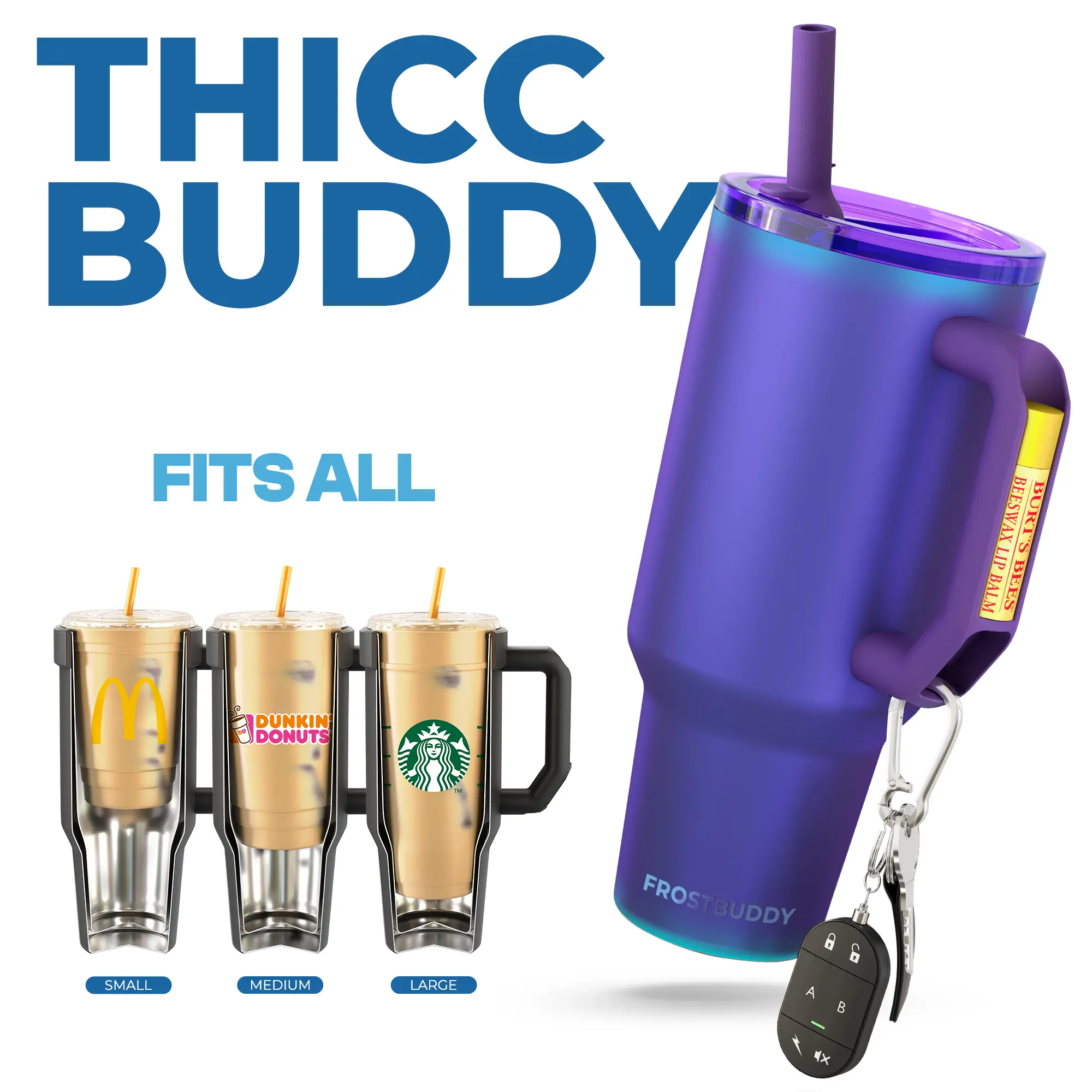


![[Gift Box & Straw] 40oz Coke Est 1886 Anniversary Stainless Steel Tumbler with Handle, Retro Coca-Cola Polar Bear Double Wall Vacuum Insulated Travel Mug, Fits Car Cup Holder, Christmas Holiday Gift](https://p16-oec-general-useast5.ttcdn-us.com/tos-useast5-i-omjb5zjo8w-tx/fd56d07ac3be415b95480976f52b0753~tplv-fhlh96nyum-resize-webp:600:612.webp?dr=12190&t=555f072d&ps=933b5bde&shp=8dbd94bf&shcp=a6e80448&idc=useast5&from=2378011839 "[Gift Box & Straw] 40oz Coke Est 1886 Anniversary Stainless Steel Tumbler with Handle, Retro Coca-Cola Polar Bear Double Wall Vacuum Insulated Travel Mug, Fits Car Cup Holder, Christmas Holiday Gift")


Frost Buddy

4.6
6.1K sold
$44.99


Related Searches
Related Categories
Introduction
The Coca-Cola logo is more than just a brand identifier; it is a symbol of refreshment and enjoyment recognized worldwide. Since its inception in 1886, the Coca-Cola logo has evolved while keeping the essence of its original design. With its classic Spencerian script and bold red color, the logo has become synonymous with the beverage itself.
Throughout the years, Coca-Cola has introduced various versions of its logo, each reflecting different marketing strategies and cultural trends. Here are some key points about the Coca-Cola logo:
Throughout the years, Coca-Cola has introduced various versions of its logo, each reflecting different marketing strategies and cultural trends. Here are some key points about the Coca-Cola logo:
- Timeless Design: The logo's elegant script has remained a constant feature, showcasing a blend of tradition and modernity.
- Color Psychology: The vibrant red color evokes feelings of excitement and happiness, making it an effective choice for attracting consumers.
- Global Recognition: The Coca-Cola logo is one of the most recognized logos in the world, transcending language and cultural barriers.
- Marketing Campaigns: Special editions of the logo have been created for various campaigns, including holiday-themed designs and regional variations.
- Proven Quality: Trusted by millions, Coca-Cola continues to innovate while honoring its rich history.